
 USE CASES
The default WooCommerce My Account page greets a returning customer with a sentence, a list of links and three forms. It is functional and completely anonymous — the same screen for a first-time buyer and someone who has ordered from you forty times.
You do not need a membership plugin or a custom account template to fix that. Here are the changes that actually make a difference, roughly in order of effort.
The single biggest visual change for the smallest amount of work. A photo under the greeting turns a generic screen into a personal one, and it is a checkbox.
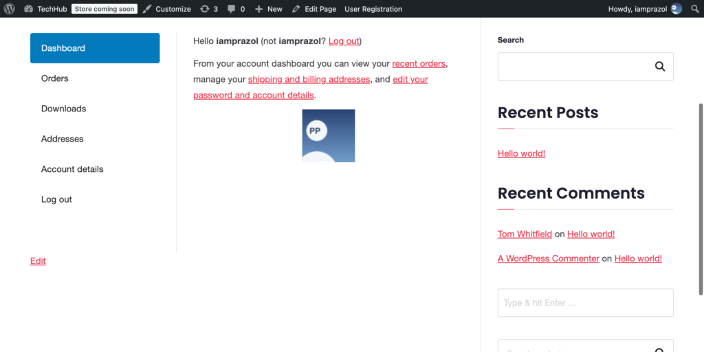
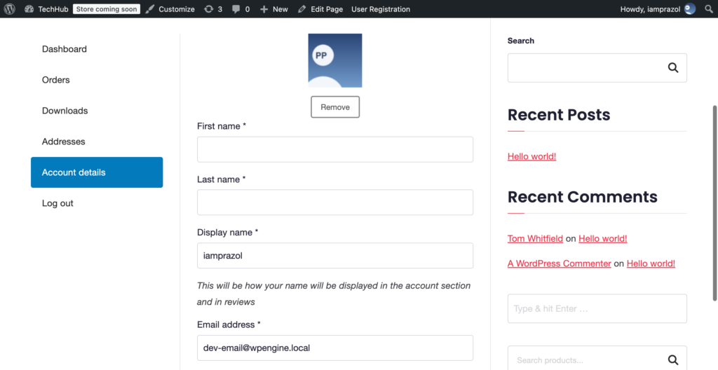
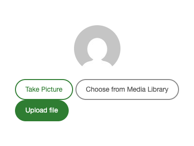
The important half is giving customers a way to set it. Switch on the My Account uploader in Users → Users Avatar and the widget appears on the Account details form, which is where a customer already goes to change anything about themselves.
The default text — “Hello name (not name? Log out)” — reads like a system message, and the parenthetical is the loudest thing in it. Overriding dashboard.php in your child theme lets you say something a person would say, and put the log-out link somewhere less prominent.
While you are in there, the dashboard is a good place for the one or two things customers actually came for: their most recent order and its status, rather than a list of links to pages containing that information.
Under WooCommerce → Settings → Advanced, every account endpoint has a slug field. Clear one and the tab disappears. If you do not sell downloads, remove Downloads. If you have one shipping address per customer, the Addresses tab can often go too.
Fewer tabs makes the remaining ones easier to find, and stops customers clicking into empty screens that make the store look unfinished.
The stock table gives an order number, a date, a status and a total. What customers usually want is where the thing is. Showing an avatar above the table is a small touch that makes the page feel like part of the account rather than a report.
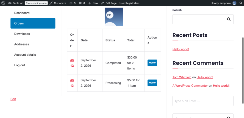
If order status is the real question, that is a job for order tracking rather than styling — but do not underestimate how much of “this store feels well-run” comes from the account area not looking like a database export.
Most themes style the shop and checkout carefully and then leave My Account with default WooCommerce styling. Customers notice, even if they could not tell you why. Bring the buttons, spacing and type in line with the rest of the store.
The avatar widget is built for this: every size, shape and colour in it is a CSS custom property on its container, so it can be matched to your theme with one rule and no !important.
The account area is the one part of a store that only existing customers see — the people who have already paid you and are most likely to pay you again. It is worth more than the default forms suggest, and most of the improvement is an afternoon’s work.